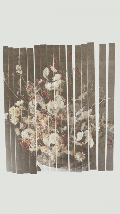
Mixed Media, Print and Digital, 2025
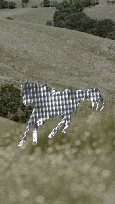
Mixed Media, Aluminum and Film, 2025
Landish
A significant brand revitalization project for Landish, a Canadian-owned smarter food company. Lifestyle-focused objectives met through design.

I. Brand Design
II. Art Direction
III. Packaging
IV. Marketing
Aurora's Harvest
A complete brand system was developed for Aurora’s Harvest, a family-run sea buckthorn farm in Ontario. The scope included logo design, visual identity, art direction, and website. The brand was crafted to reflect the farm’s values of honouring the berry, local production, and natural wellness—while positioning it to collaborate with wellness spaces and product lines through wholesale partnerships.

I. Art Direction
II. Brand Identity
IV. Web Design
Vo Beauty
The brand look and feel were elevated to match the evolution of facialist Diana VO and her clientele. An authentic merging of timeless elegance with a holistic touch.

I. Art Direction
II. Brand Identity
IV. Packaging
IV. Marketing
VI. Web Design
Mejuri
I worked alongside the marketing team at Mejuri to create digital ad assets across Meta and Google, as well as visuals for email marketing campaigns. Each piece was designed to align with Mejuri’s brand aesthetic while driving performance across paid and owned channels.

I. Marketing Design
Soulcraft
A visual identity and digital presence for Soulcraft, the evolving practice of textile artist Madison Monteze.
Grounded in the slow, intentional rhythms of spinning, weaving, and knitting, the brand evokes a sense of warmth, tactility, and deep-rooted tradition.
The identity system weaves together earthy tones, textured type, and hand-drawn graphic elements that reflect Madison’s commitment to craft as both a personal ritual and communal offering.
Her website (coming soon) serves as a living archive and gathering place—featuring patterns for sale, seasonal offerings, and opportunities to connect through fibre.

I. Brand Identity
II. Web
Shakta Rising
The design work for Shakta Rising was guided by the brand’s profound purpose: to be a beacon of transformation, light, and empowerment. With a mission rooted in helping individuals reclaim their divine power, heal pain, and lead with love, the visual identity embodies these themes through thoughtful and intentional design elements.

I. Brand Idenity
II. Web Design
Insight
Insight is a conceptual brand exploration for a booze-free bar and lounge, inviting you to open your mind and heart through meaningful, present connections with friends. Insight fosters a sense of community through culinary discovery—offering herbal tinctures, creative mixes, and nourishing bites. The visual identity draws upon calming blue hues and fluid, exploratory shapes, embodying a serene yet playful atmosphere where curiosity thrives.

I. Brand Identity
Gaby Azorsky Healing
A refined visual identity and packaging for Gaby Azorsky’s flower essences, rooted in heirloom simplicity and designed to let the energetics of the plants speak for themselves. The logo and packaging reflect a timeless quietude, pared back, intentional, and elegant, allowing the subtle power of each remedy to take center stage.
Every design choice honours the lineage of healing and the gentle potency of nature’s intelligence.

I. Brand Identity
II. Packaging
Seasons Of Self
A complete brand identity and designed a custom membership portal to support their 8-week cohort experience. Rooted in the rhythm of the seasons—Spring, Summer, Fall, and Winter—the program invites participants to honour their own inner cycles through bi-weekly sessions that alternate between expansion and integration.

I. Brand Identity
II. Web + Membership Portal
Draftline YYZ
Collaborated across Labatt brands (Budweiser, Budlight, Stella, Palm Bay, Mike's Hard) on print, digital, merch, and social, ad/marketing creative.
Led merch design and supported art direction for Budweiser, creating assets aligned with brand and cultural moments.
Contributed to new product innovation through early-stage design, art direction, and activation concepts.
Art directed photoshoots while worked closely with the AD and copywriter to deliver trend-driven content
and campaign execution.

I. Brand Design
II. Marketing and Ad Creative
III. Art Direction
IV. Packaging Design
Spiral Deeper
Icon design for podcast, Spiral Deeper, a place of nourishing conversations that relate to self, earth, and beyond.
Flowing from crown to root. Within this icon there is an intricacy that speaks to the relation of moving through a spiral, or labyrinth, and connecting through intersections that may feel sticky where you are forced to meet self and then continue onwards.

II. Iconography

THE RETREAT by CARLEY X KAMI MARCHAND, 2024

THE RETREAT by CARLEY X KAMI MARCHAND, 2024

I'M NOT SPIRALING, 2023

888Hz, 2023
